ESPRIT Quick Shopping FeatureProject Overview: Optimise the quick shopping experience for users on the ESPRIT website so that items can be added to their carts directly from the Product Listing Page (PLP).
The quick shopping feature needs to be integrated within the Design System to cover all stylistic variations of the website across the global regions.
My Role
UI/UX Designer
Main point of contact for the project
Timeline
2023 - 2024
Tools
Figma
Platform
E-commerce
User Stories
“As an online shopper, I want to quickly add multiple products to my cart from the Product Listing Page, so that I can save time and avoid unnecessary navigation to individual product page.“
As a mobile user, I want a simplified and accessible "Quick Add to Cart" button, so that I can easily shop on a smaller screen without accidental clicks or extra step.”
Pain Points
Lengthy navigation process
⚠️ Users have to visit individual product pages to add items to their cart, making the shopping process slow and tedious.
High cart abandonment rates
⚠️ Many shoppers abandon their carts due to excessive steps before checkout, leading to lost sales and frustration.
Objectives
Design and optimise a Quick Shopping feature for the rebranded ESPRIT US website.
Integrate the new feature within the global Design System.
Goals
Enable a faster and more seamless shopping experience.
Reduce cart abandonment rates caused by lengthy navigation processes.
Improve the overall usability and accessibility of the product selection process.
the process1. Analyse the existing solution and identify areas of improvement
After gathering existing screens and analysing the currently implemented feature, the following areas of improvement were identified:
Adding a drawer instead of an overlay on a mobile resolution for improved accessibility.
Adding a loading state for the quick shopping button.
Adding a mini cart to larger resolutions to provide immediate feedback to users.
Improve size selection design for better accessibility.
Adding a new medium-size break point to further optimise the responsiveness for tablet-size devices.
(Desktop) A flow diagram depicting the existing quick shopping features with current website screens.
https://www.esprit.us/
(Mobile) A flow diagram depicting the existing quick shopping features with current website screens.
https://www.esprit.us/
2. Ideate an optimised solution: User Flows
To define the most efficient shopping experience, we mapped out the user journey for the Quick Shopping feature. Key steps include:
Browsing the Product Listing Page (PLP): Users navigate to the category or search for products.
Quick Add-to-Cart: Users add items directly from the PLP without visiting individual product pages.
Mini-Cart Confirmation: A confirmation pop-up appears, allowing users to review their cart without leaving the page.
Product Customisation: The user has the option to switch between the different product colours and find their size.
Confirmation: Opening a mini cart and adding button states to communicate the completed task.
MVP Improved Quick Shopping feature flow.
3. Wireframes & Design
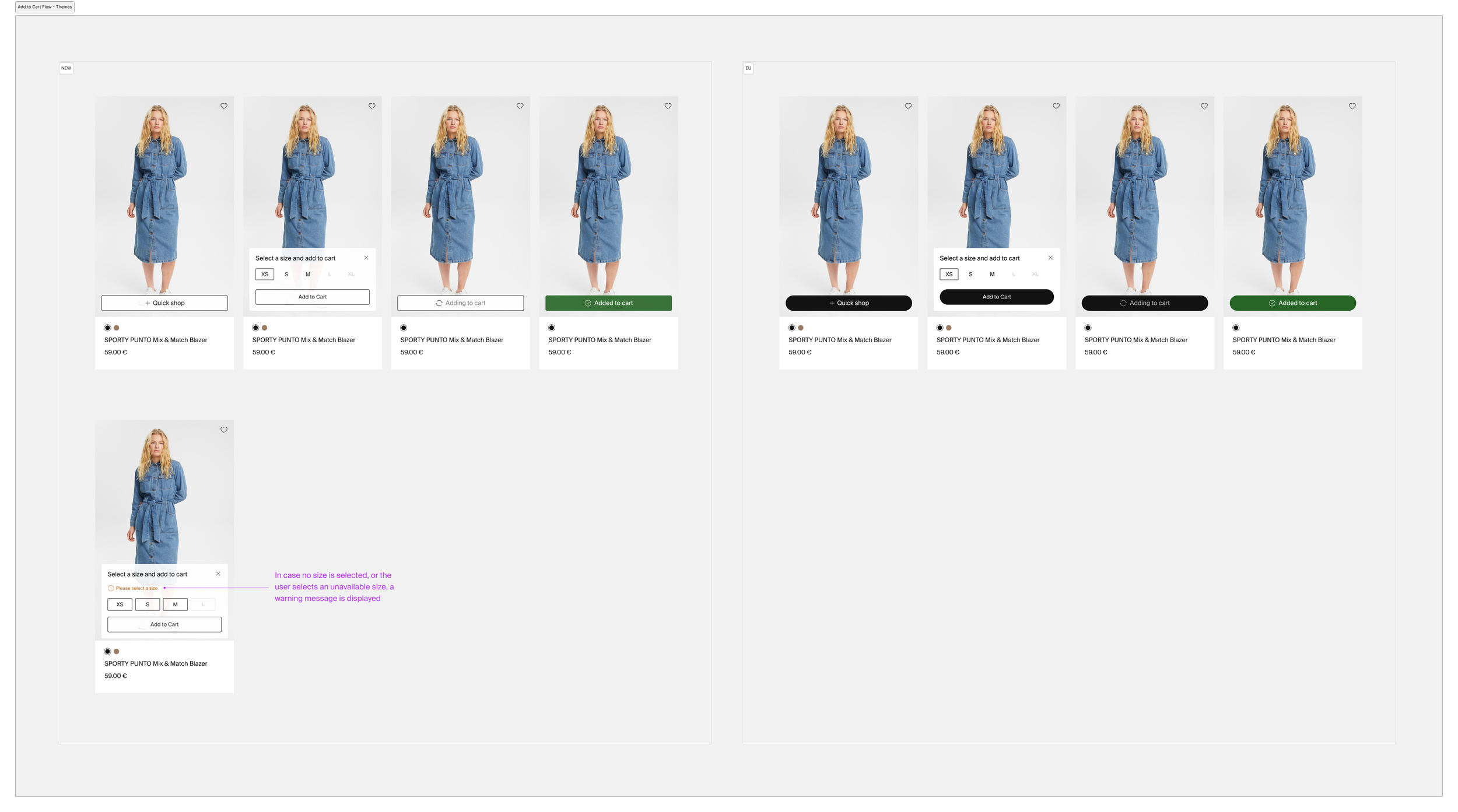
Quick Shopping layer overlay
A "Quick Shop" button appears on hover over the product image on the Product Listing Page.
The user is then prompted to select a size from the size selection layer overlay on top of the image.
Additional Button states
A loading and success states were added and optimised for the different brand variations in the global regions (EU and US).
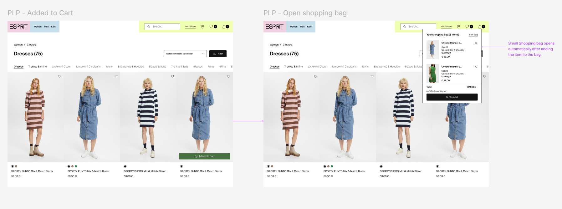
Mini Cart
Mini cart drop-down opens to confirm the successfully added product.
Responsive design
To ensure a seamless user experience on all devices, 3 breakpoints were defined for the Desktop (Large), Tablet (Medium) and Mobile (Small) resolution.
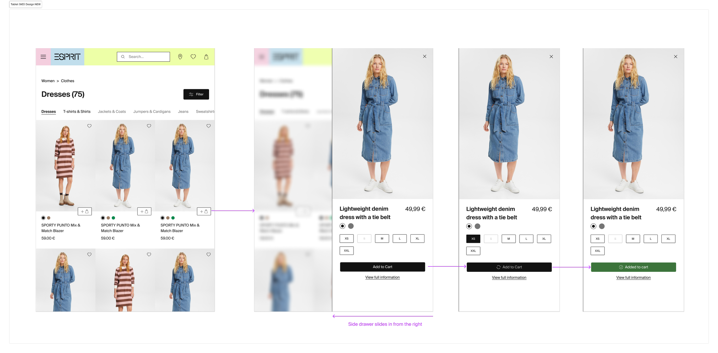
For the Small and Medium screen sizes, the size layer appears in a modal (or drawer) overlay (slide-up for mobile and side slide-in for tablet).
Quick Shopping Screens SM (mobile) resolution.
Quick Shopping flow optimised for MD (tablet) resolution.
Size Layer Optimisations
The following design optimisations were included in the size selection layer overlay (Desktop):
Added hover and selection states of the size buttons.
Improved size & alignment of the size buttons.
Removed scrolling state from the overlay, and instead implemented a responsive height to accommodate the number of different sizes.
Component Specifications & Design System Integration
This section provides an overview of the design specification of the elements. New components were created to integrate the new design into the Design System.
The component was optimised to cover the branding of the website across different market regions by using component variations & different themes.
Design specifications for the new button and size layer components (desktop).
Design specifications for the mobile drawer overlay component. The component is optimised for the branding variations across different regions.
4. Next steps
The next step of the process would be design validation, where tests are performed to ensure the design meets users’ needs and improves their shopping experience.
Testing methods that would be used in this scenario are usability tests with live prototypes or A/B testing.
When performing a usability test, users would be asked to complete the task of adding products to their cart without leaving the Product Listing Page. This method would provide insights into their overall experience and potentially pinpoint areas of further improvement.
Performing A/B testing will allow us to compare variations in UI elements and checkout flows. An A/B test can be conducted comparing the shopping behaviour with and without a quick shopping feature, and measure the difference in the cart abandonment rate.
5. Conclusion
The "Quick Shopping" feature optimisation addressed user pain points by enabling a faster, more intuitive shopping experience.
The next step in the process would be a testing stage where the new design is validated. This would show whether there are measurable improvements in key business and user metrics, such as cart abandonment rates.


