bloom: online flower storeProject Overview: This project was created as a part of the CareerFoundry UI Certification course.
The objective was to design an e-commerce app, using the mobile-first design approach while taking ownership of all stages of the design process, including the creation of brand identity, research process, visual design and user testing.
My Role
UX/UI Designer
Timeline
Apr 2022 - May 2022
Tools
Sketch
Adobe XD
Platform
E-commerce
About
BLOOM is an online store providing a wide range of flowers and bouquets. With its minimalistic and stylish design, BLOOM provides an easy and enjoyable shopping experience for everyone.
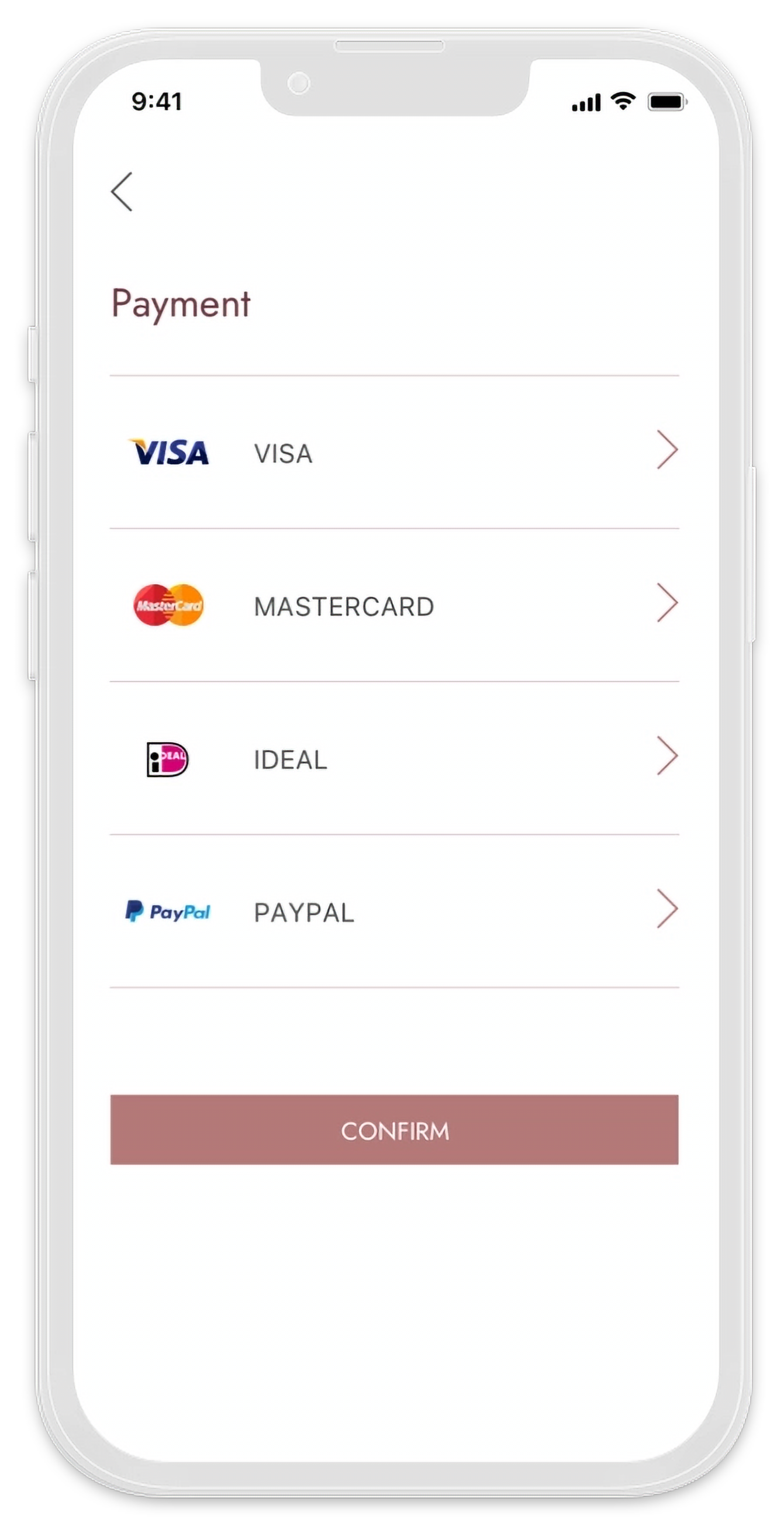
Users can browse a wide variety of products directly from the Home page and apply quick, or advanced filtering options. The checkout process is smooth and intuitive and users are provided with a variety of payment options.
Objectives
📌 Create a clean and elegant UI that aligns with the brand identity of BLOOM.
📌 Ensure seamless browsing with a well-structured product display.
📌 Implement advanced filtering and search options for easy selection.
📌 Design an intuitive and efficient checkout process.
Problem Statement
Many online flower stores struggle with cluttered interfaces, confusing navigation, and inefficient checkout processes.
My goal was to design a modern, intuitive, and visually appealing platform that allows users to quickly find and purchase flowers with minimal effort.
Pain Points
⚠️ Convenience: Picking up flowers from a physical store can be time-consuming and inconvenient.
⚠️ Returns: Most flower delivery services do not allow returns if the product’s look/quality does not match the customer’s expectations.
⚠️ Quality: Flower delivery services can compromise the quality of the flowers/bouquets.
User Stories
“As a new customer, I want to access the inventory without having to register, so that I can make sure this store has what I’m looking for before having to create an account. “
“As a customer, I want to have access to advanced filtering options, so that I don’t have to browse through a lot of products to find what I’m looking for. “
The Design Process1. User flows & sketches
I started with creating a user flow for the customer journey through the app. The flow was then translated into sketches to define the layout and core functionalities.
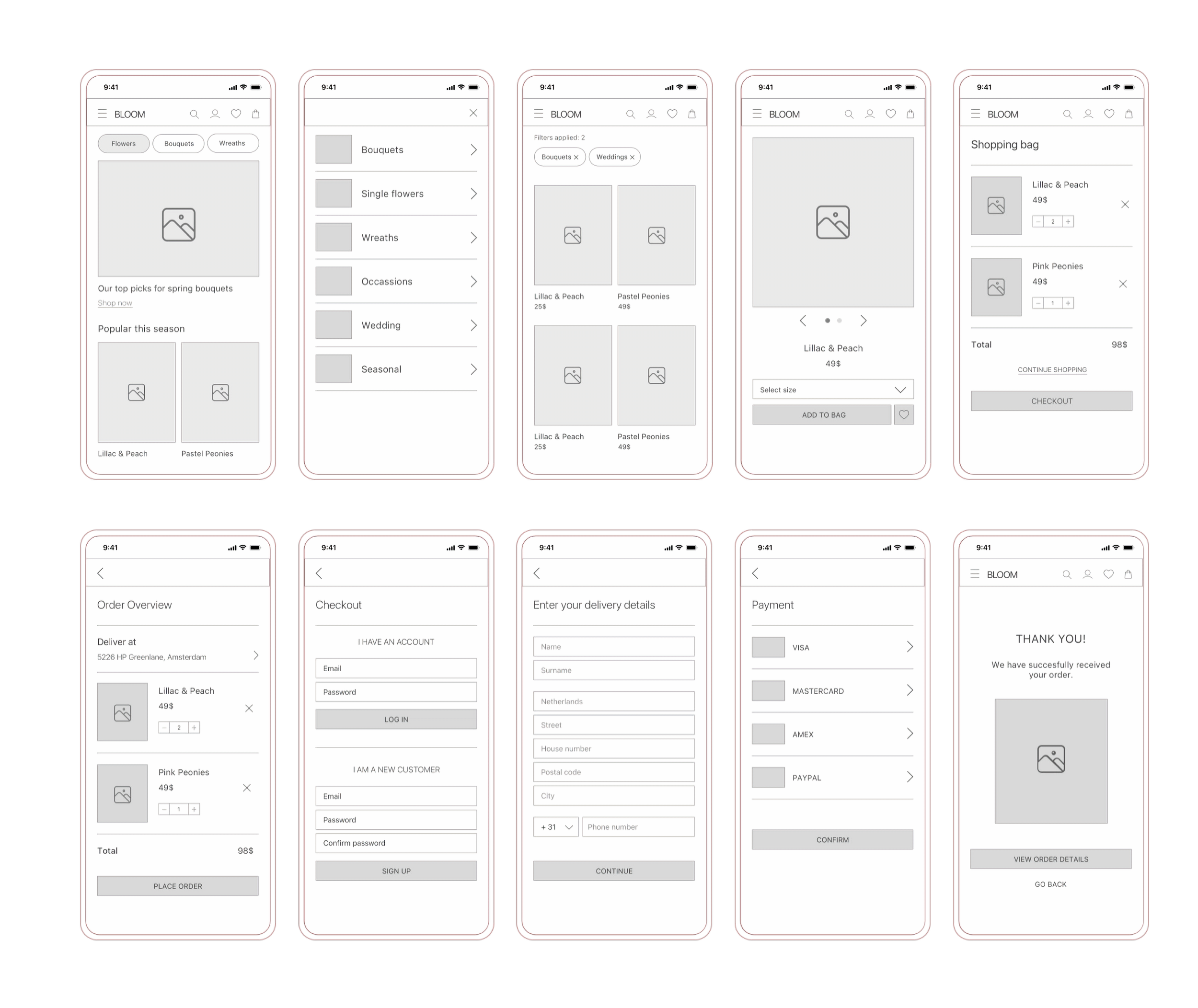
2. Wireframes
3. Usability Tests & User Insights
After creating a mid-fidelity prototype of the app, I conducted usability testing. The results from the tests were analysed and used to define design iterations before proceeding with the final high-fidelity design.
❤️ What users loved:
The app is intuitive: Users found the app intuitive and easy to navigate. Simple walkthrough from 'Home' to 'Checkout'.
Easy to navigate: Users enjoyed the easy access to 'Favourites' and 'Search' options from the Home and Product page.
Shopping bag access: Users found it easy to add a product to the shopping bag and then access the bag from the Product and Home screens.
⚠️ What needs improvement:
Button visibility: The 'Shop Now' button on the Home page was not noticeable enough.
Home screen: Users found the big image on the Home page confusing, as it was originally linking to a selected category and not a specific product.
Product access: Users would like to be able to browse products directly from the Home screen.
✅ Design iterations:
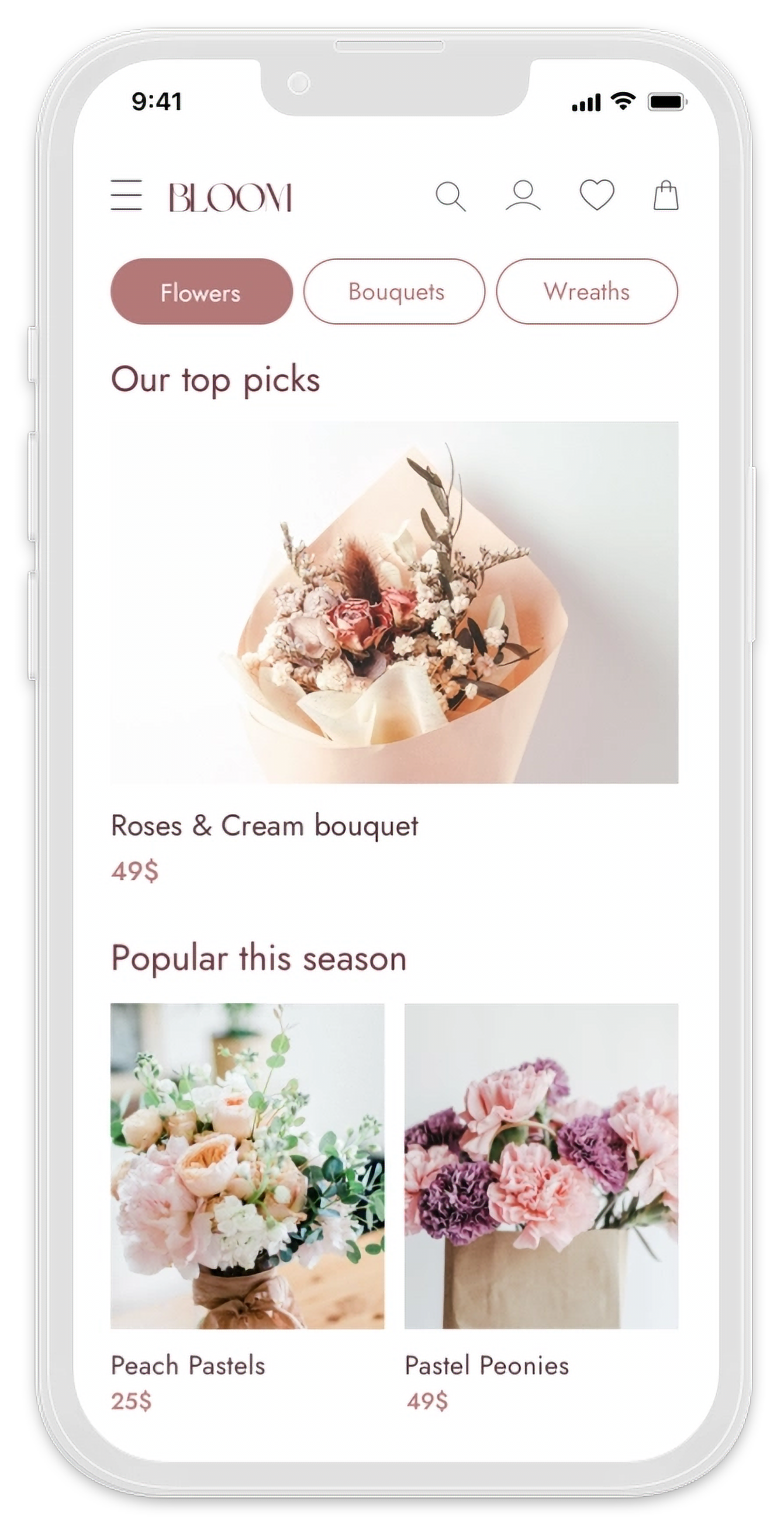
Added product highlights: The 'Shop Now' button was replaced with a highlight of products on the Home page.
Linked products: The big image on the Home screen was linked to a highlighted product and not a category.
Products overview: Users will be presented with an overview of products to shop directly from the Home screen.
3. Final Design
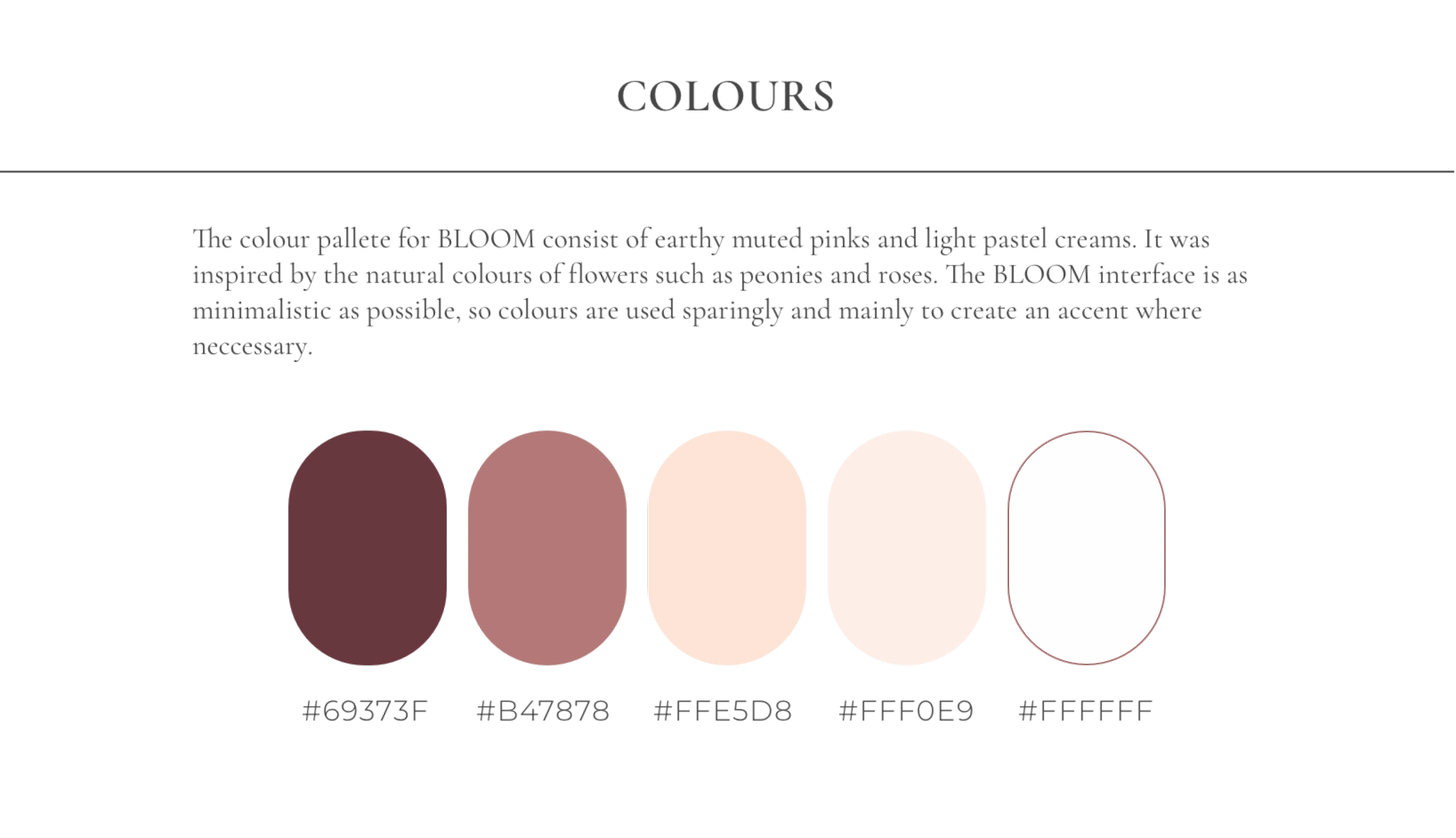
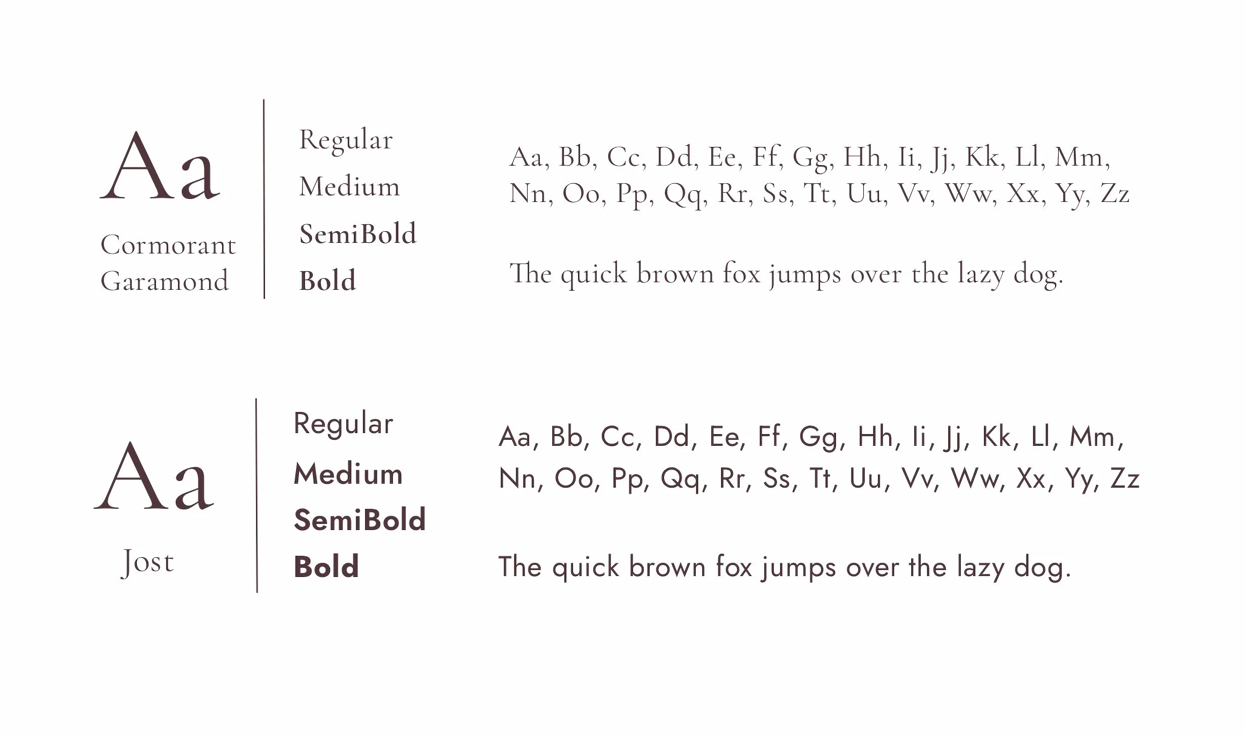
The final design follows a minimalistic aesthetic with a soft colour palette, elegant typography, and intuitive navigation. The design prioritizes clarity, accessibility, and an engaging user experience.
Landing & Home
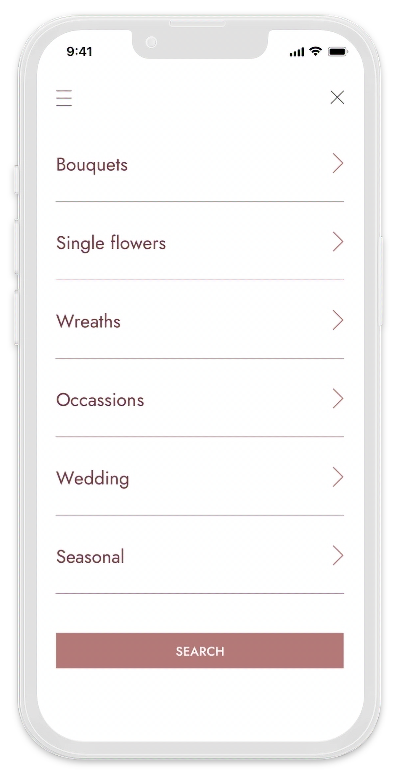
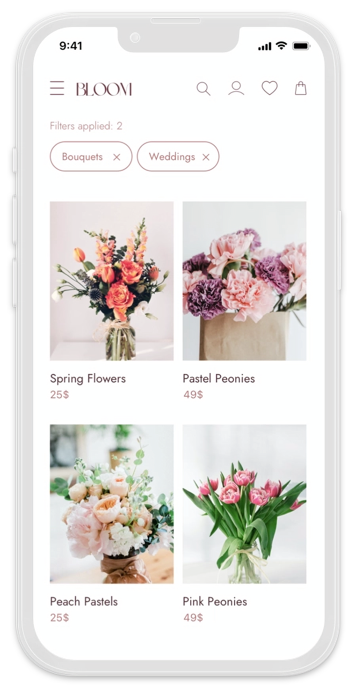
Advanced filtering options are easily accessible from the Home screen. Users can filter products by several categories and occasions. Filters can then be easily removed from the Results page.
Advanced Filters
Advanced filtering options are easily accessible from the Home screen. Users can filter products by several categories and occasions. Filters can then be easily removed from the Results page.
Product Page & Shopping Bag
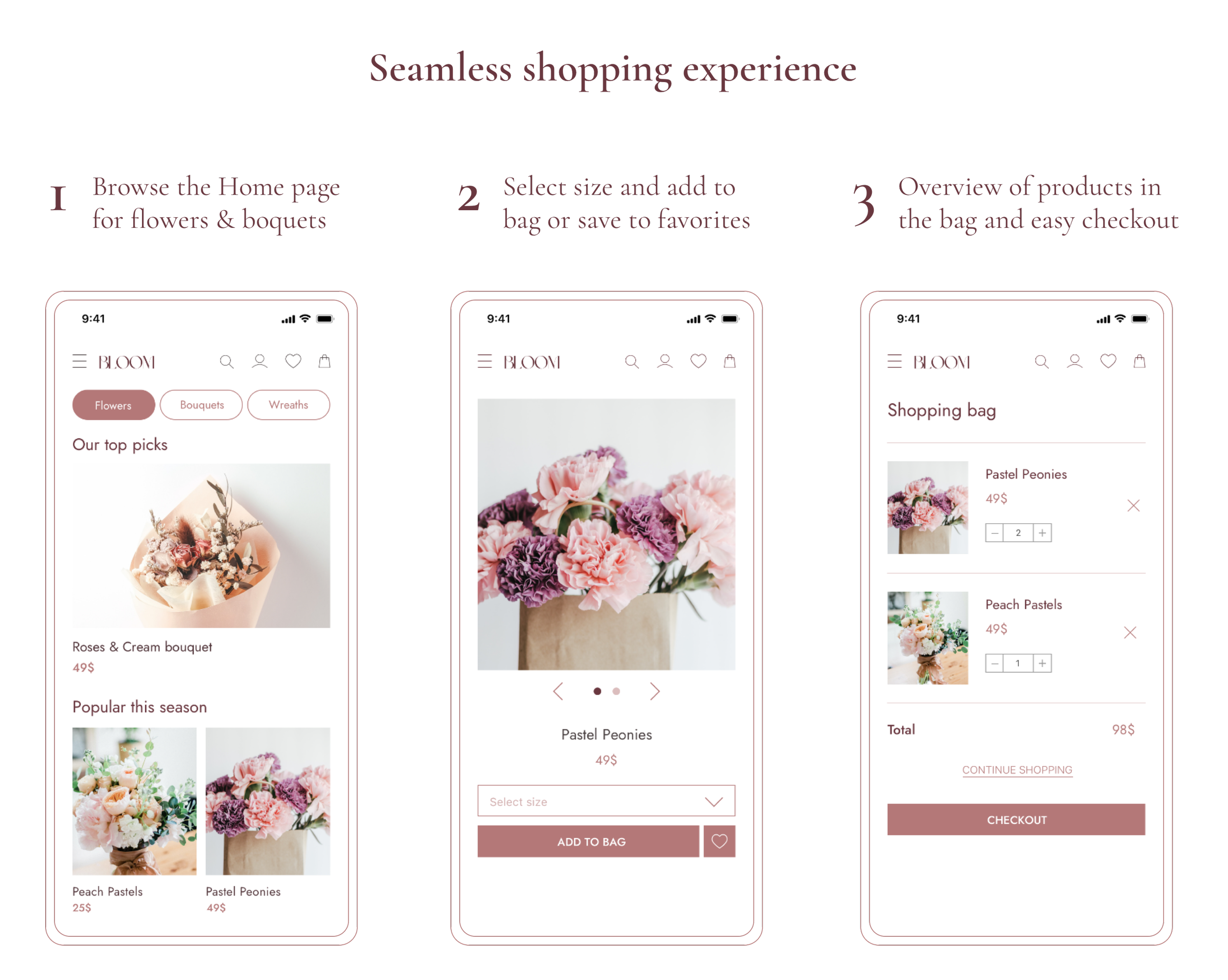
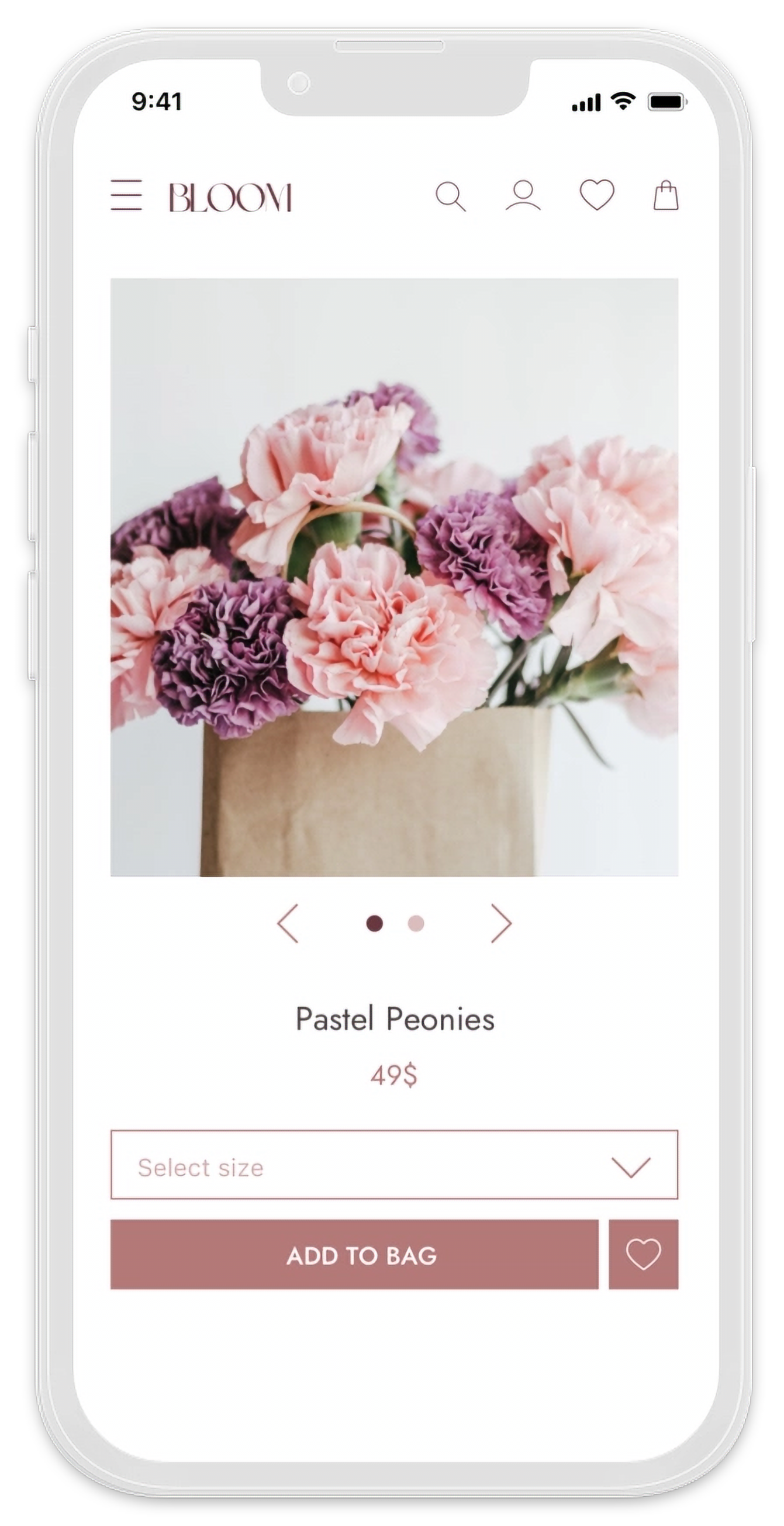
The Product page provides an overview of the product details. Users can choose the desired size of the bouquet and add it to the Shopping bag or save it to Favorites.
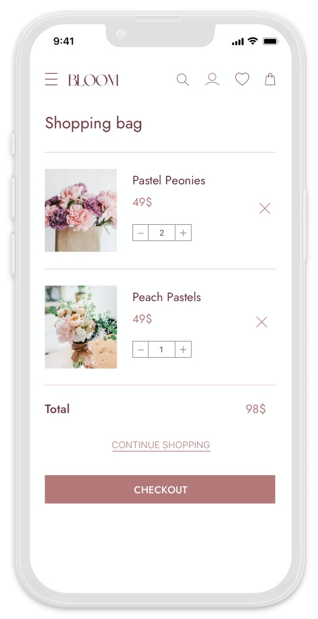
Users can shop for multiple items and adjust the quantity from the Shopping bag.
Checkout & Delivery Details
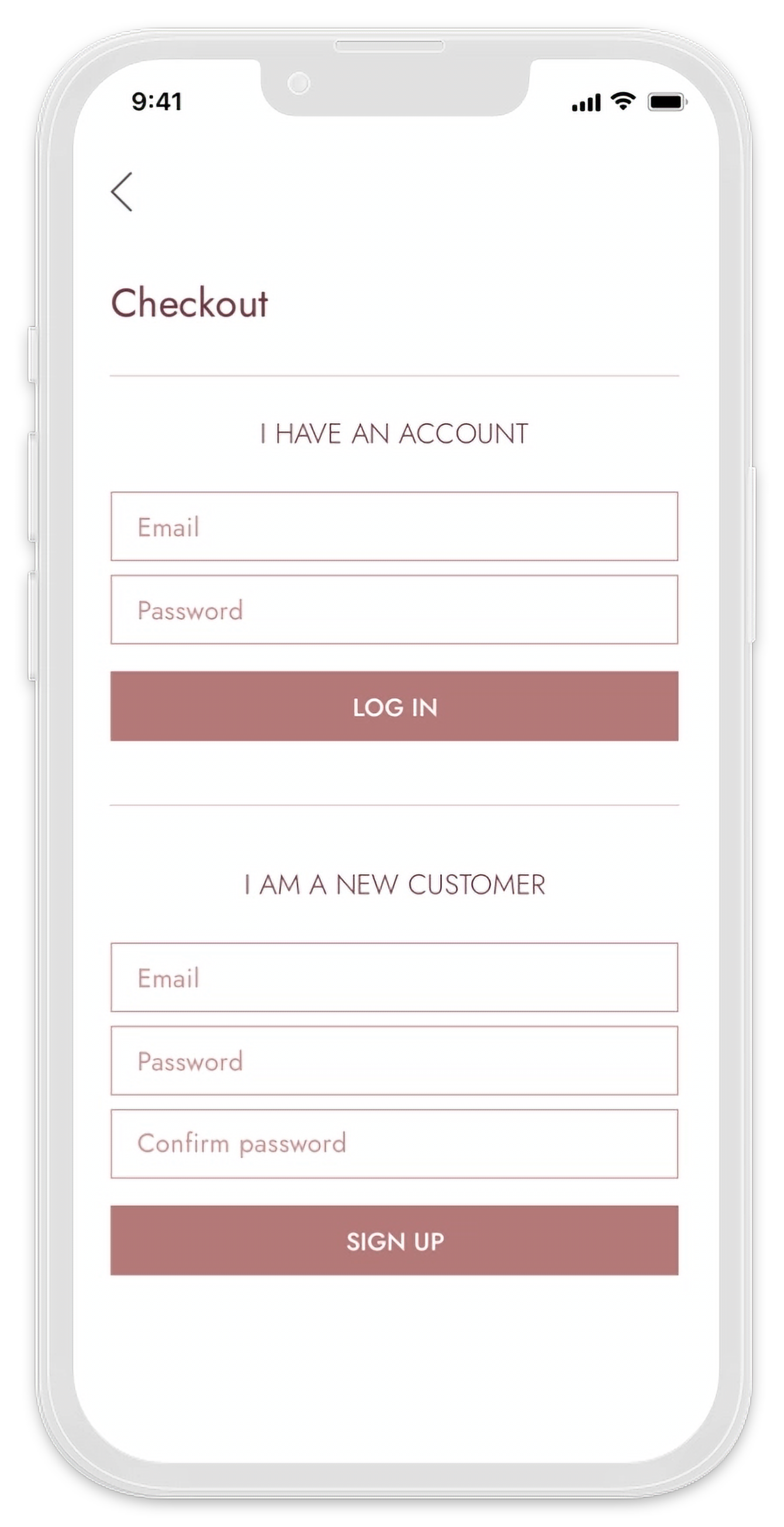
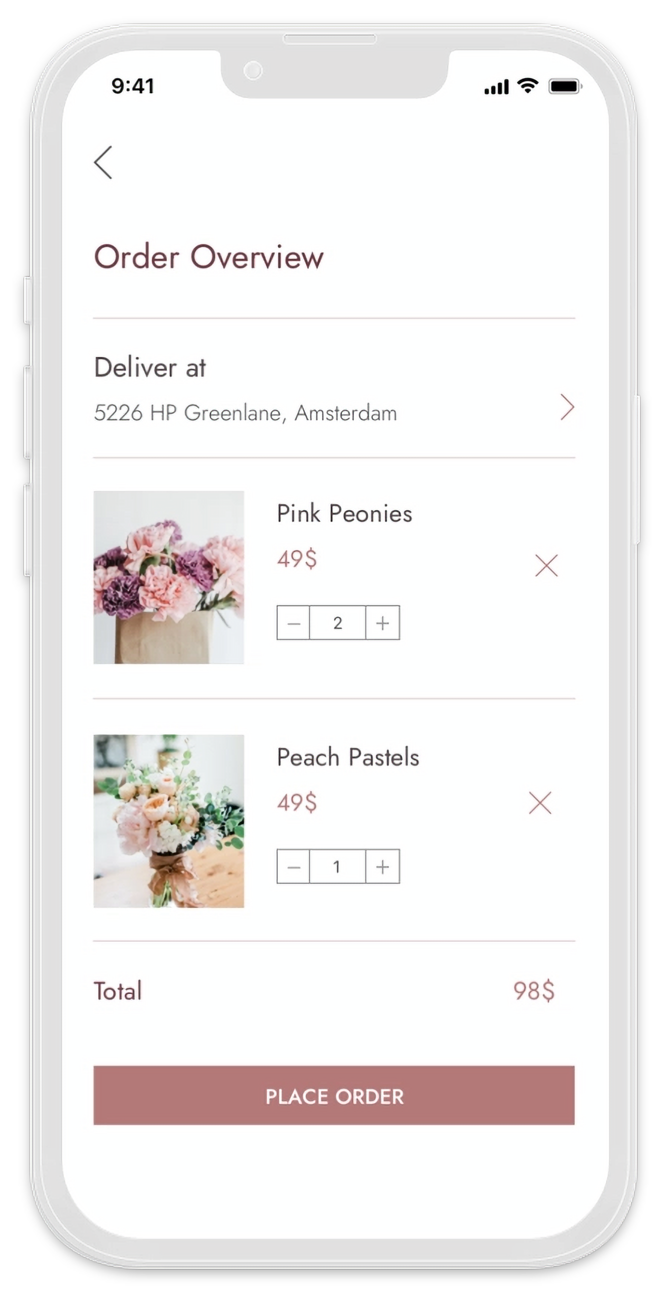
Returning users can log in to their accounts to complete their purchases, while new customers are provided with an option to sign up. New users can then enter their delivery details to complete the purchase.
Payment & Confirmation
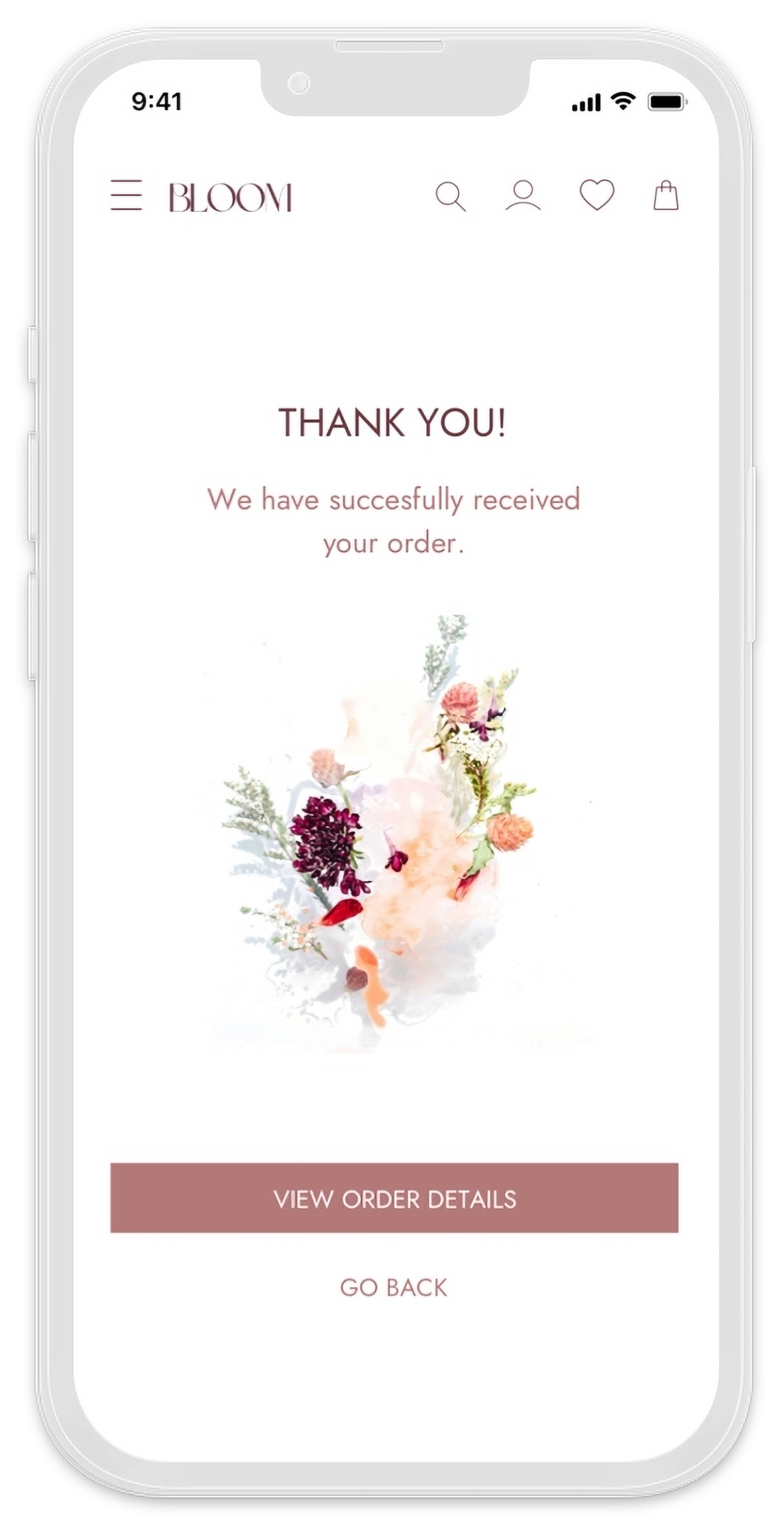
Advanced filtering options are easily accessible from the Home screen. Users can filter products by several categories and occasions. Filters can then be easily removed from the Results page.
Learnings & Conclusion
What went well:
Branding & Visual design - I had very clear idea from the start of how I wanted the app to look like. Once I designed the logo, it was very easy to create a style guide and apply the visual design consistently through the app screens.
What could have been better:
User testing process - I could not recruit a large number of participants for the testing. I was still able to conduct usability tests and gather sufficient information but I would like to have input from more participants in the future.
For the future:
Planning - I would plan ahead of time and focus more on recruiting participants for my usability tests.


